At a bridal expo held at a Chicago O’Hare-area hotel in late 2015, the big conversation was colour. Three themes stood out for the 2016 season: Lustre, Lavish and Sorbet. Congratulations again to all the engaged couples who stopped by to talk palettes.
A decade later, it’s fascinating to see where each of those trends went. Here’s a look back — and forward.
Lustre
Lustre was all about sheen: pearl, champagne and metallic finishes, satin linens and mirrored surfaces. It was the trend that made sequin overlays a wedding staple.
Where it went: lustre softened into today’s “quiet luxury” — brushed champagne metals, pearl accents, satin rather than sequin. Try it with ivory florals and lots of candlelight.
Lavish
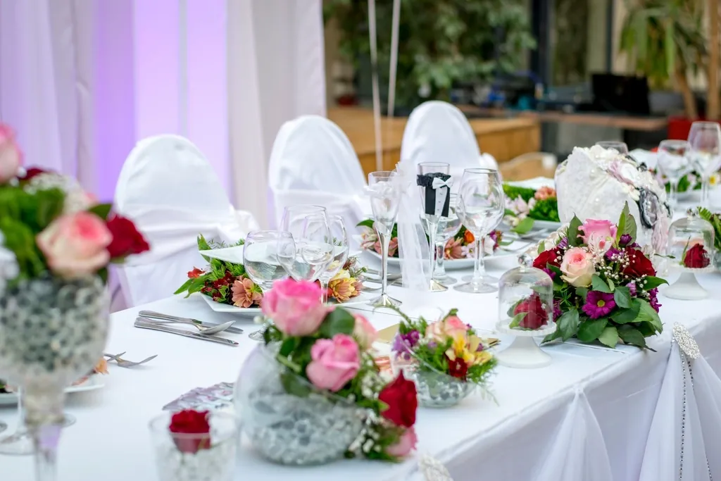
Lavish meant more: jewel tones, tall centrepieces, abundant florals and dramatic draping. Think burgundy, emerald and gold in a ballroom.
Where it went: maximalism is back in a big way — hanging floral installations, moody palettes, velvet linens and “tablescapes” layered with candles, fruit and texture.
Sorbet
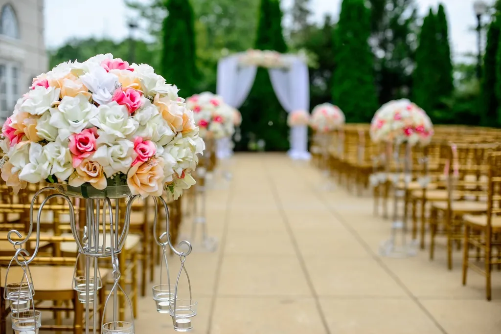
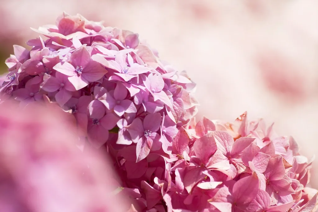
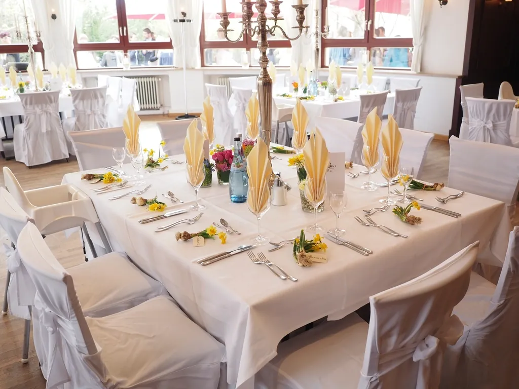
Sorbet was the playful one: peach, coral, mint and lemon pastels, perfect for spring and summer garden weddings.
Where it went: sorbet tones grew up into today’s garden palettes — coral peonies, apricot roses and sage greenery. See “Garden Coral” in our palette studio.
Choosing a palette that won’t date
- Anchor trend colours with neutrals — ivory, champagne, greenery.
- Put the trend in replaceable elements (florals, linens) rather than permanent ones (the dress, the invitations’ main colour).
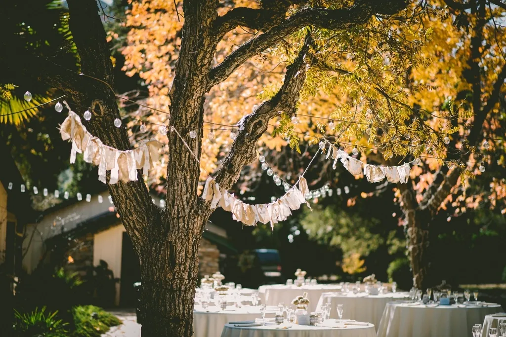
- Choose for your venue’s light: warm tones in candlelit ballrooms, fresher tones in daylight gardens.
Browse the inspiration gallery for current takes on each, or read Give me everything that sparkles for the glamour edit.
Planning something?
Want a palette that feels current but won’t date your photos? Let’s build one together.
Start your inquiry →